Updated: January 9, 2010
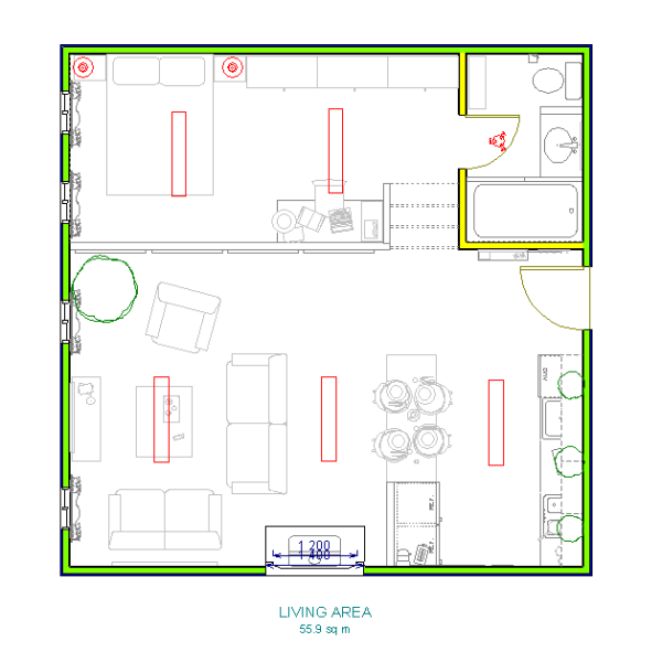
Ah, Debbie Travis. I love her shows. I suppose it has to do mostly with all that honesty radiating from the screen. The design in this article is my version of the condo the finalists in the first season of From The Ground Up had to tackle. The challenge was to design a 600ft2 apartment, which is equivalent to 58m2 of floor space. That's not a lot. You can barely squeeze in a small bedroom, an open concept kitchen-living-dining room and a very small bathroom, while providing bags of storage and the illusion of a bigger space. Yep, that's why it's called a challenge.
Well, the main issue with designing small spaces is keeping them open and airy, having a natural flow and lots of light. However, if the walls and furniture are to be kept to a minimum, storage becomes an issue. That's why I created the Interior Modern Basement (IMB), which consists of raising the floor in some areas and installing sliding drawers underneath. This is demonstrated later on.
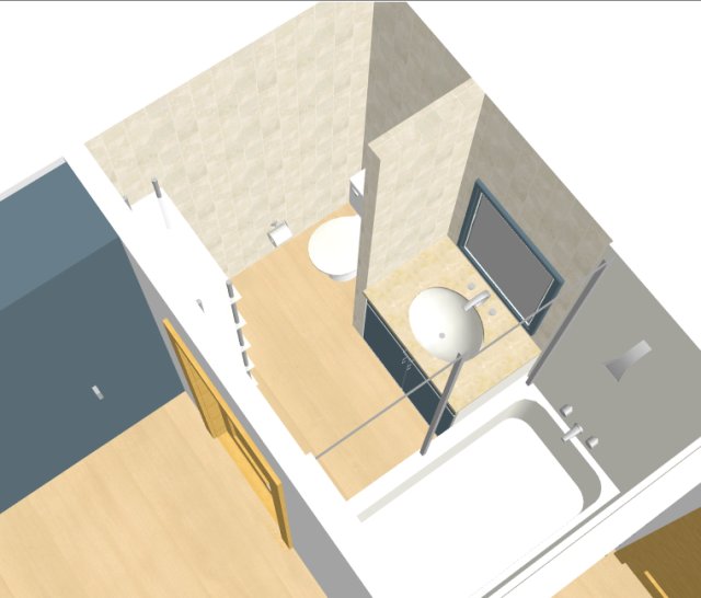
Additionally, I wanted to incorporate all the necessary functions in this apartment, so there's a proper kitchen, a comfortable living room, an entertaining space, and even a small home office. Despite my affection for shower cubicles, here I decided to place a tub, merely to demonstrate that this can be done despite the limited space.
Gallery
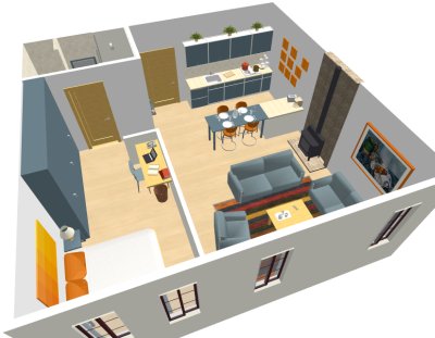
Well... it's a square. Not an easy shape to work with, considering that you have to incorporate at least 5 different types of rooms. So, the concept is an open plan loft-like studio apartment. I added the loft-like to the description because of the high ceiling and windows.
Here you can see the design in 3D from several different angles.
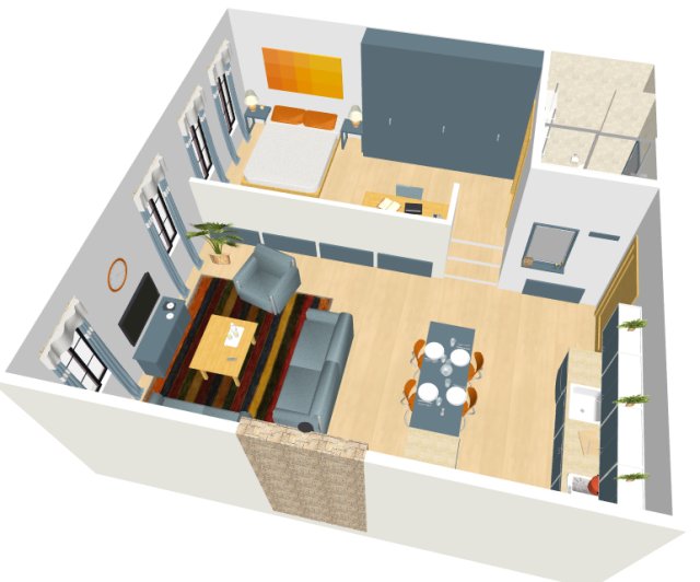
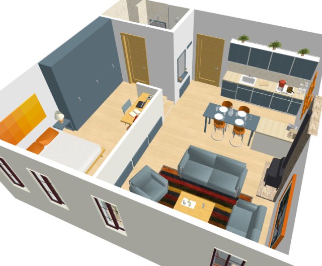
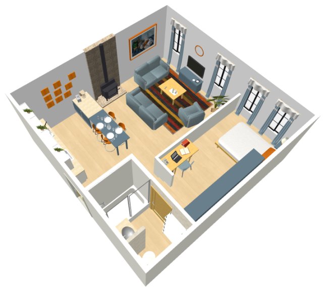
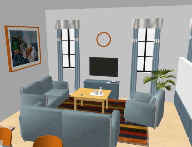
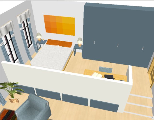
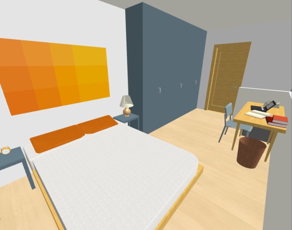
The color scheme is neutral whites or cremes and light blue, accented by complementing bursts of orange. The blue panels you see on the dividing wall are the front ends of the interior basement drawers, which run the whole width of the raised part of the apartment. There's even one under the bathroom, albeit a slightly shorter one.
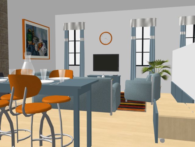
By the way, despite the floor space limitation, storage doesn't have to be just hidden. The picture behind the loveseat sofa can be easily replaced by a shallow display cabinet, a bookcase or even a couple of shelves, for those favorite items of yours you'd like to show off.
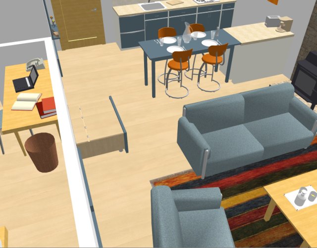
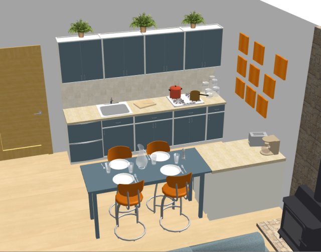
The kitchen is very streamlined because of the built in appliances. A large fridge would have been an eye-sore in this setting, and so was replaced by undercounter fridge and freezer that blend right into the cabinets. There are also a dishwasher, overhead cabinets and plenty of work surfaces. The kitchen also serves as a dining room with a very long and separate bar-height table, that can easily seat 6 people.
The bedroom doubles as a home office, yet it doesn't feel closed in, mainly due to the loft-like design. And again, more storage can be added without disturbing the airy feel, something along the lines of additional filing cabinets or low shelving units.
Conclusion
The color scheme remains cohesive throughout the apartment. There are only a few different colors used in this design, tying the rooms together and making them appear as one larger space, considerably bigger than it really is. Not bad for 58m2. Not bad at all.
Have fun!