Updated: October 8, 2025
As time goes by, more and more software interfaces are becoming less and less ergonomic. This stems from the fact both the desktop and the mobile form factors are mature. There's little left to innovate, or if there is, we're talking boring details under the hood. So changes come for the sake of it, and they are usually aesthetic. Case in point, the Liquid Glass makeover in iOS 26.
I have an old iPhone 11, which I mostly use for testing - ideal for this kind of scenario. I upgraded the operating system, spent a little bit of time using it, and then figured that the whole transparency and blurring stuff is so 2008 (Compiz, amirite), and they don't add or help in any way. By and large, so far, my impression of the iOS look and feel was positive. For example, in my opinion, the iPhone has the best font clarity of all the different systems I tried, especially in low light conditions. For Windows, the peak was Windows 7. For Android, it was Android 10. With the iPhone, the 18.X family had the right mix of cool and sleek. Now, Liquid Glass is the new chic, and in this guide, I'd like to show you how you can somewhat reduce its effects, for improved usability and clarity. Let's commence.
Accessibility options
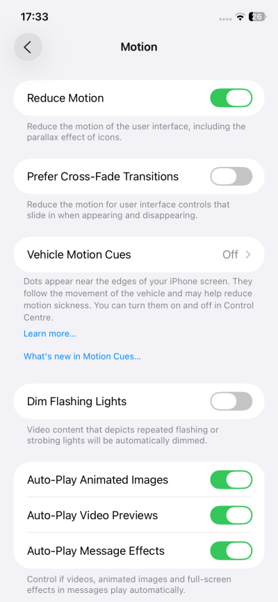
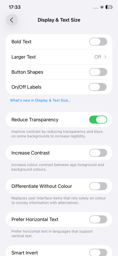
If you don't like the wobbly swipe effect, the glass shimmer, or the blurring of menus as you scroll, then you need to change a couple of Accessibility options. Bonus points, this also happens to improve the UI speed and responsiveness, although to be fair, the iPhone has always had fast, quick menus, and there's no performance degradation from one major release to another. To wit:
- Accessibility > Motion > Reduce Motion.
- Accessibility > Display & Text Size > Reduce Transparency.
Now, the scroll menu top/bottom won't show blurred:
Notice the top border, though.
The effects also ... affect the home screen. Better clarity here, too:
![]()
![]()
Look at the bottom quartet. If there ought to be an artificial border, you might as well make it count, right. Otherwise, why not make the bottom set just like all the other icons on the screen?
Home screen icons
Speaking of home screen, by default, you will probably have reasonable, colorful icons. If you by any chance land with the newly designed glass icons, you can change those. Long press on the screen, Customize. Then select the icon set that best works for you. The new stuff is visually cool, but it also makes it more difficult to discern apps and select the right one. Milliseconds, but they do add up.
![]()
![]()
Clock
The worst offender, in my book, is the lock screen. The new glass clock is almost impossible to read at a glance, which is what you actually want. Luckily, you can easily customize this. Choose a different font, and select "solid" as the render option. This will take care of the problem.
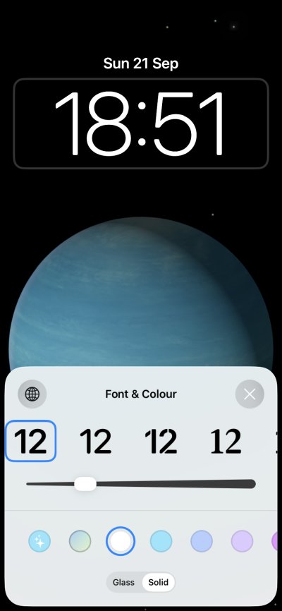
Why would the clock be glassy and the date not? This triggers me OCD chakras.
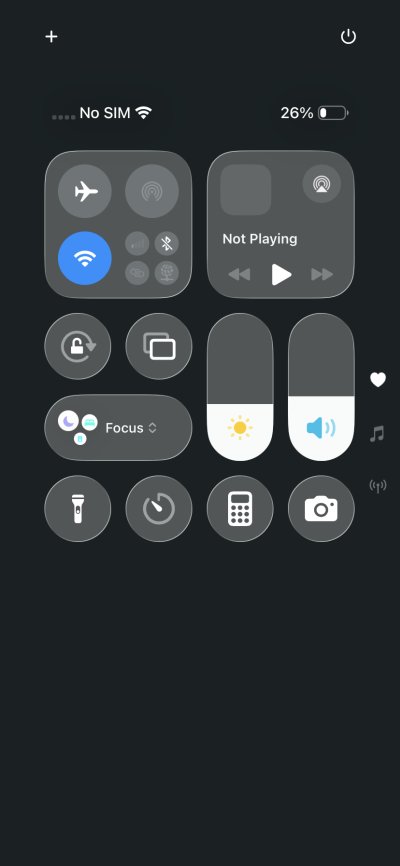
However, the overlay menu and screen padlock will remain glassy and transparent. In Android, for example, turning transparency also affects these elements of the UI. This half-change creates a somewhat inconsistent look and feel. The thin borders also feel like an incomplete product.
Side effects
If you reduce transparency, there will be some small negative side effects. For example, in the App Store, the search field will look weirdly positioned, with almost no top border. Notice the difference before and after. This actually feels like a badly executed idea, because the search element could have had an extra 20-30 px top margin to make it look nicer.
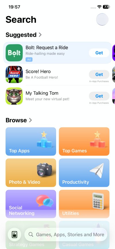
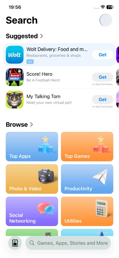
With transparency and without. The one without actually looks better. It's cleaner, more readable. Why would I need to see what's under the search field when the entire focus should be on what's inside it?
Also, the screenshots taken with transparency have a different color profile (Display P3), but the ones without, didn't trigger a popup in GIMP while editing, so I assume you get a standard sRGB profile. Very intriguing. An aside, but still worth mentioning.
Conclusion
I am not really fond of Liquid Glass. Does it look nice? Yes. Is it practical? No. There should be no transparency in software interfaces. After all, if you need to work with something, a window, a panel, an element of some sort, then you want that to be in focus, and nothing else. Software interfaces are already too busy, too crowded, too hard to navigate. Adding yet more information only makes it harder to absorb data, find the relevant stuff, and act in an efficient manner.
With iOS 26, you have some leeway in reverting the changes, but the options are partial and somewhat inconsistent, as not all menus or widgets change accordingly. Actually, when I think about it, this should be flagged as a bug, because accessibility means exactly that. And if a user makes a change, because they say have impaired vision, then the change ought to be comprehensive. How is a person going to write the correct PIN for their screen lock if they struggle seeing the actual number pad buttons? So yeah. All in all, hopefully this guide gives you some productivity back. I'd like to hope the dot-one release of iOS 26 will introduce some much needed fixes. From your favorite peasant, farewell.
Cheers.